Scoring the PSL Scorecard: a design tour of cricket scorecards around the world
How the design of the PSL scorecard has changed over time — and how it stacks up against the other leagues
It’s been a while since I complained about minor stuff that no one really cares about.
After advertising jingles and Pakistani banking apps, the unfortunate victims of my latest design critique are cricket scorecards.
So here’s an evolution of the PSL scorecard: how it’s improved (and regressed) over time, and how it compares to other T20 leagues around the world. Here we go.
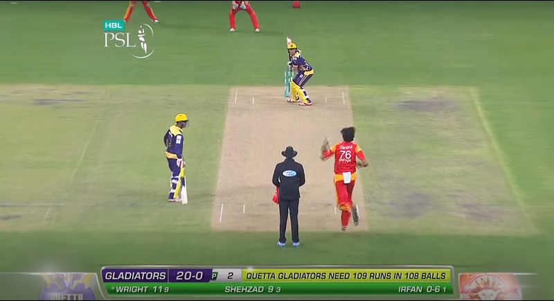
PSL 1
Personally not a huge fan of the lime-on-green color combo here — which is also bewildering considering they’ve used purple for the Gladiators’ side of the scorecard to match their kit, but not orange for Islamabad.
The font size and spacing for the batsmens’ scores could also do with some breathing room: the 11(9) is a little too small and close together for my liking, especially given they have the entire width of the screen to make use of.
Score: 4/10
PSL 2
The style remained largely unchanged for the next edition of the PSL, except the bottom bar is now in a neutral white/silver color — which is infinitely more readable.
They’ve also used a two-tone palette for the batting score: ‘Karachi’ in dark blue and ‘7–0’ in light blue; making it much easier on the eye than before.
Score: 5/10
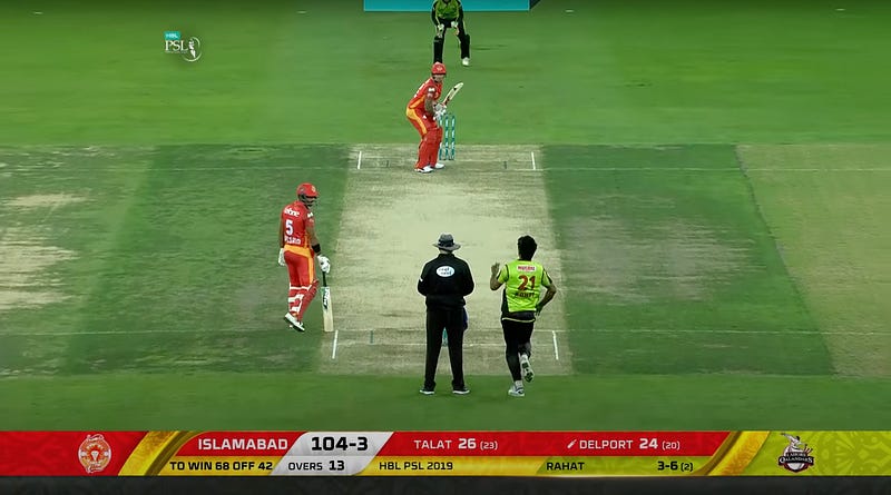
PSL 3
This edition favored the use of a gold trim around the scorecard, which worked okay for some teams. Here’s Quetta’s purple kit making for a decent purple-and-gold combo:
But as you can imagine, things quickly go downhill when you pair Lahore’s less-than-flattering green with the gold trim:
This edition also favored rectangular edges instead of the curves from the previous editions, leading to a rather boxy design.
PSL 3 was a regression in scorecard design. But someone probably realized that and came back with renewed enthusiasm…
Score: 3/10
PSL 4
The post-puberty glow up we’ve all been waiting for: Bigger! Brighter! Add all the colors!
Although they’ve probably gone overboard with the variety of hues, this rather fetching design is a world of a difference from the previous edition. Just scroll up and compare the two: even if you had absolutely zero interest in cricket, chances are you’d be far more likely to pause momentarily for PSL 4 while flicking through the TV.
To indicate the on-strike batsman, they’ve also moved away from the rather outdated asterisk (*), and introduced the small bat icon.
It’s also a return for the curves; and, for the first time, filling in the team colors around the edges, using the full width of the screen.
Score: 6.5/10
PSL 5
At this point, the entire script was rewritten.
The colors are more muted, more solid, and — at least for me — more palatable.
The previously left-aligned score has now been moved to the center, which feels more natural since that’s where your eyes tend to focus. Perhaps this is too much detail, but the exact center of the scorecard aligns near-perfectly with the parting of the umpire’s legs — a big win for the harmony between cameraman and graphic designer.
It also forms a batting vs bowling dichotomy on either side of the scorecard: all the batting stats (in the batting side’s colors) on the left, all the bowling stats (in the bowling side’s colors) on the right, and a neutral scorecard in the center to separate the two. Wonderful.
Gone also are the curves, but thankfully this isn’t a return to the rectangles. Straight-edged but diagonal: sharp, but with a bit of personality.
Score: 8/10
PSL 6
It’s the return of the curves. Lots of them. Curve all the things. Even the over progress bar is now circular instead of a parallelogram.
The gradients meeting in the middle are a lovely touch (although admittedly it doesn’t work quite as well with Lahore’s horrendous green).
Here’s a few more gradients, with mixed results:
This is probably my favorite PSL scorecard. So much life, so much energy.
They’ve hit it out of the park here (pardon the pun).
Score: 9/10
PSL 7
Which brings us to the current edition of the PSL.
I can’t help but feel this is a regression. It’s not bad, but it feels awfully similar to PSL 5.
Except it’s slightly worse than PSL 5, because they’ve changed the directions of the diagonals to all face the same way:
I feel like the opposing diagonals added more of a competitive element: it’s Team A vs Team B, and they’re head-to-head against each other.
Reverting back to the old design is a shame, but at least they brightened up the colors: you can see Quetta’s purple in PSL 7 vs PSL 5 above: huge difference.
Score: 7/10
A Scorecard Tour Around The World
Let’s see how the PSL stacks up against the most recent editions of the various T20 leagues around the cricket-playing world.
India
The IPL has quite a lot going on.
The team names are abbreviated (KKR, compared to Lahore in the PSL), and the score is left-aligned. It’s also quite rectangular, except for the far ends with the team crests. The on-strike batsman is indicated with an arrow. Not quite as charming as a tiny little bat icon, but it’ll do.
And perhaps rather tellingly for the state of T20 cricket, they put the batsmens’ scores smack in the middle of the screen, instead of the team score.
Definitely eye-catching, if nothing else.
Score: 7/10
Bangladesh
The BPL’s scorecard is…hideous.
About half the space is occupied by the team crests on either side, leading to the actual important information being all smushed together in the middle. Just look at the spacing between Kayes’ score and Narine’s name. And then the bowler’s name immediately after that. And the tiny little |> is perhaps the worst way to indicate the on-strike batsman.
Also the random stepped design at one end of the scorecard is, well, random:
Perhaps the downward-sloping graph is indicating the trajectory of their design team’s salaries.
Overall, this is not something that screams “Watch me!” on TV.
Score: 2/10
Australia
Hands down my favorite of the lot.
This is the only ‘dark mode’ scorecard I’ve seen, and they’ve done it wonderfully well. The only minor annoyance is the Australian tradition of putting the wickets before the runs.
The score itself is easily the largest thing on the card, and has a distinctive, readable color. The batters’ names are nicely spaced out, and even though the bowler’s name doesn’t quite have the best contrast with purple-on-black in this specific team’s colors, it’s still decent enough.
Only the essentials, and nothing else. Fantastic.
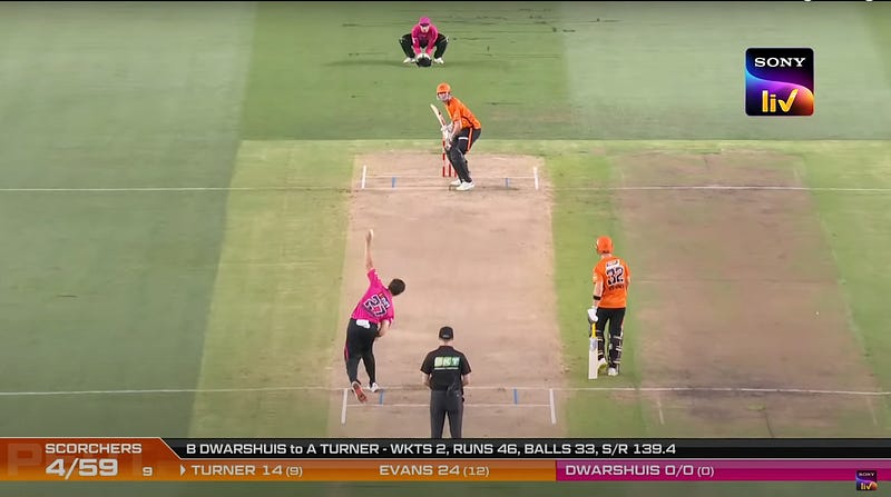
By contrast, here’s the exact same match being broadcast on an Indian channel:
Certainly a lot flashier, or as I like to say, “khatta meetha” — which is perhaps a running theme in the design of subcontinental cricket. Not to mention the choice of font is just about the worst one I’ve seen in this analysis.
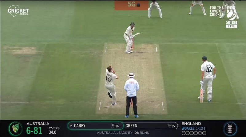
They’ve also replicated this design for the Ashes series:
This one is perhaps my all-time favorite scorecard ever. The green and blue work fantastically well with the black background, which in itself adds contrast to the white Test kits.
Notice also how they’ve paid homage to the more straight-faced nature of Test cricket by indicating the on-striker batter with a subtle glow around the edge of the name bubble, rather than fully filling it in for the T20 version:
Top stuff.
Full marks.
Score: 11/10
New Zealand
A peculiar country with a peculiar design.
They’ve got the right idea: they’ve tried to balance the colors, and the score is big and bold. This is probably the most readable score.
But the team names (CAN and WEL) haven’t been spaced out properly, making them collide with the other information. And in yet another variety of ‘what should we put in the center’, they’ve gone for the match-winning equation. Odd, but…perhaps it makes sense?
Score: Either a 4 or an 8, I can’t decide.
Afghanistan
A throwback to the early days of the iPhone.
With the half-rectangular, half-curved bubbles, the 3D bezels, and the drop shadows, this design is straight from 2010.
They’ve tried to match each relevant piece of information to the team, but ended up in a haze of red and green that’s all over the place.
Score: 3/10
England
In true English fashion, the scorecard is rather subdued for a T20 league.
It’s all been slimmed down into a single line of information, rather than the usual two-tiered structure. And sure, there’s splashes of color, but some splashes are rather confusing — where’s the red coming from?
It offers comfortable spacing, the essential information, and nothing more.
Truly a no-nonsense scorecard. Gets the job done.
Score: 8/10
West Indies
This one is perhaps the biggest surprise. Given the flamboyant nature of the Carribean culture, I was certainly expecting something more flashy.
But this design is about as dull as it gets.
You can see the variety of colors on show in the league logo on the top left; and in the team crests on either side of the scorecard; and even in the teams’ kits.
But the scorecard itself is quite vanilla, betraying the vibe of the tournament.
Perhaps more unforgivingly, it has the same font size for the score (88–1) as the team (Patriots). And you can barely read how many balls DJ Bravo has faced without moving the screen up to your nose.
Score: 1/10
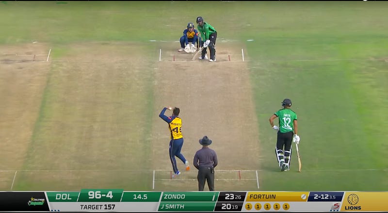
South Africa
A welcome return to team colors.
The spacing is a little too cramped for my liking (lots of wasted space on the edges), and perhaps the boxy design could be better, but this is reminiscent of PSL 7.
In true Cricket South Africa style, it’s an honest effort that’s not too bad, but not too great either. It puts up a good fight, but it’s never going to win any design trophies.
Score: 7/10
Sri Lanka
The deep hues of red and purple have a lot of potential here, but the silver/grey really doesn’t compliment either of them.
This wins the award for Boxiest Design — and to be fair, it doesn’t look completely awful; just a little too square, and a little too grey.
Score: 5/10
The World Cup
And finally, the T20 World Cup.
About as sanitized as you could expect from an international tournament: just plain white curves, filled in with the tournament logo’s colors.
A little bit of personality, but not too much; a little bit of pizzazz, but not too much; a little bit of polish, but not too much.
Score: 7.5/10
Bonus: The Hundred
The latest addition to cricketing formats: something called The Hundred, which, as the name implies, consists of 100 balls rather than 20 overs.
I’m really not sure what to make of this whole thing. It’s…pure chaos. And I’m all for it.
If the intention was to grab my attention, they’ve certainly grabbed it. With both hands, and then some.
Score: I have no idea what’s going on here.
During this analysis, it has become increasingly obvious to me that my taste in scorecard design is undoubtedly shaped by my line of work, and exposure to Western sensibilities of subtlety and minimalism.
There is no doubt a market for the bright, flashy scorecard as well; but I, for one, am not part of that market.
And perhaps more than just talking about how it looks, it merits a separate conversation on how it works. The same scorecard on a tiny phone screen at arm’s length vs a giant LED TV at a restaurant can be a remarkably different experience.
Until then — can’t wait for the T20 World Cup in Australia. The true champions of scorecard design.

