🏠 The UX of Address Plates
Does your house address plate pass The Foodpanda Test?
The humble address plate. It’s the CNIC of your house. Sometimes conspicuous, oftentimes ignored.
But is yours any good from a user experience perspective?
I’ve started reviewing address plates on my walks around the neighborhood, based on what I call The Foodpanda Test™ (following hot on the heels of The Straight-Line Test).
Here’s my criteria:
How quickly would a Foodpanda delivery rider whizzing through your street at 50km/h be able to find your house based on the address plate?
My focus is on how easy it is to read rather than how nice it looks. Because as you’ll soon see, it’s usually the nice-looking ones that are the worst offenders of usability.
With the power of editing, I’ve blurred out part of each address plate, so some of them will look a bit wonky.
Anyway, let’s start with…
The classics
These are the no-frills, no-thrills address plates.
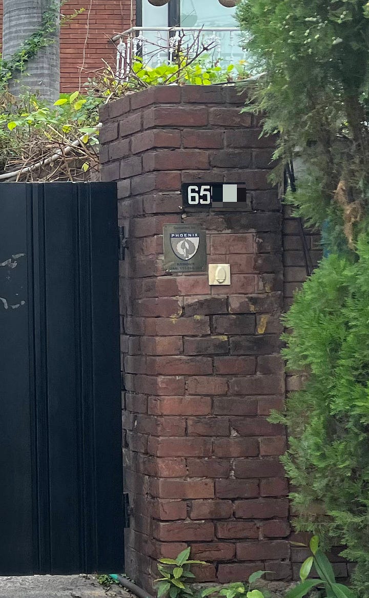
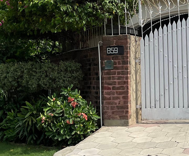
White text, black background. Nothing earth-shattering, but excellent readability.
These unassuming bad boys come in black-on-white varieties too:
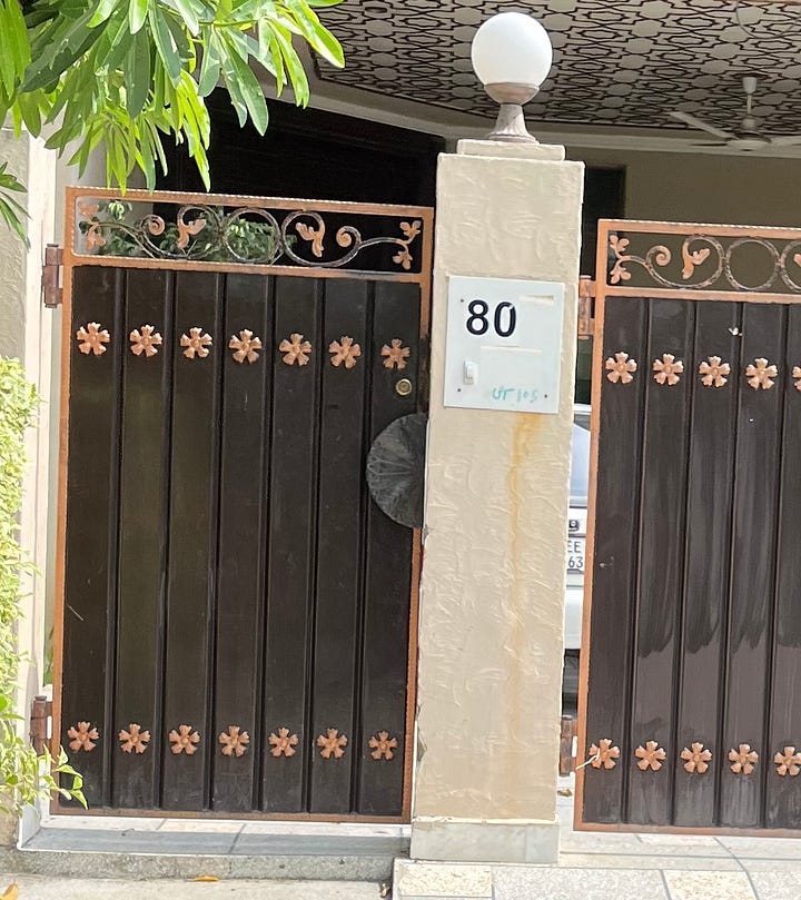
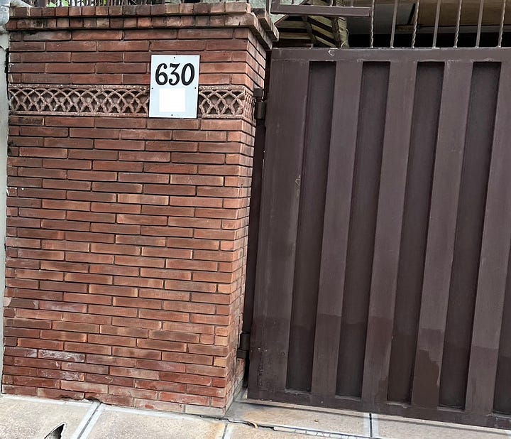
These unsung heroes do their job exactly as asked, without much fuss.
Score: 8/10
The hide-and-seek champions
One would imagine that the primary purpose of an address plate is to be, well, visible.
Behold a litany of plates that are anything but.
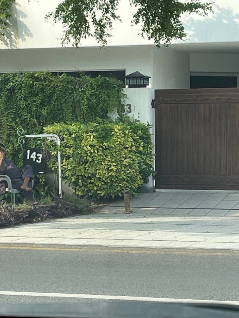
First, there’s the hidden-behind-shrubbery variety:
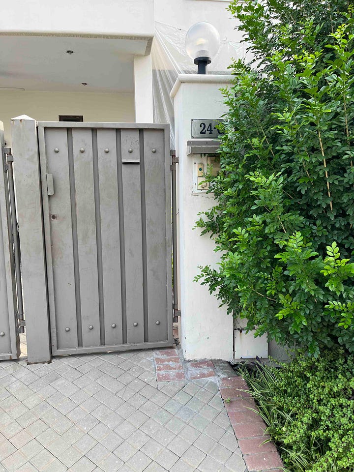
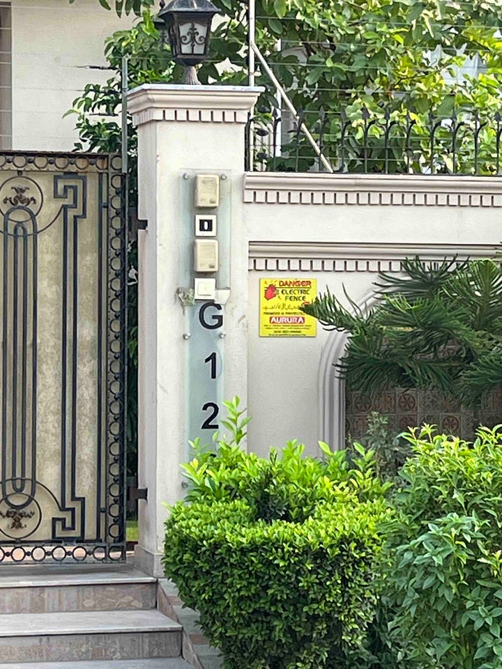
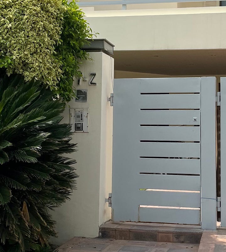
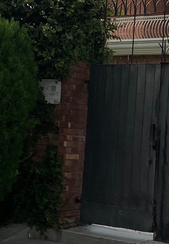
Admittedly this is mostly a problem with bad gardening rather than bad plate design.
But then there’s the hidden-by-design variety:
And finally there’s the hidden-by-incompetence variety:
I haven’t even bothered blurring out this plate, because you can’t read it anyway.
These really do defeat the point of having an address plate in the first place.
Score: 1/10
The chrome boys
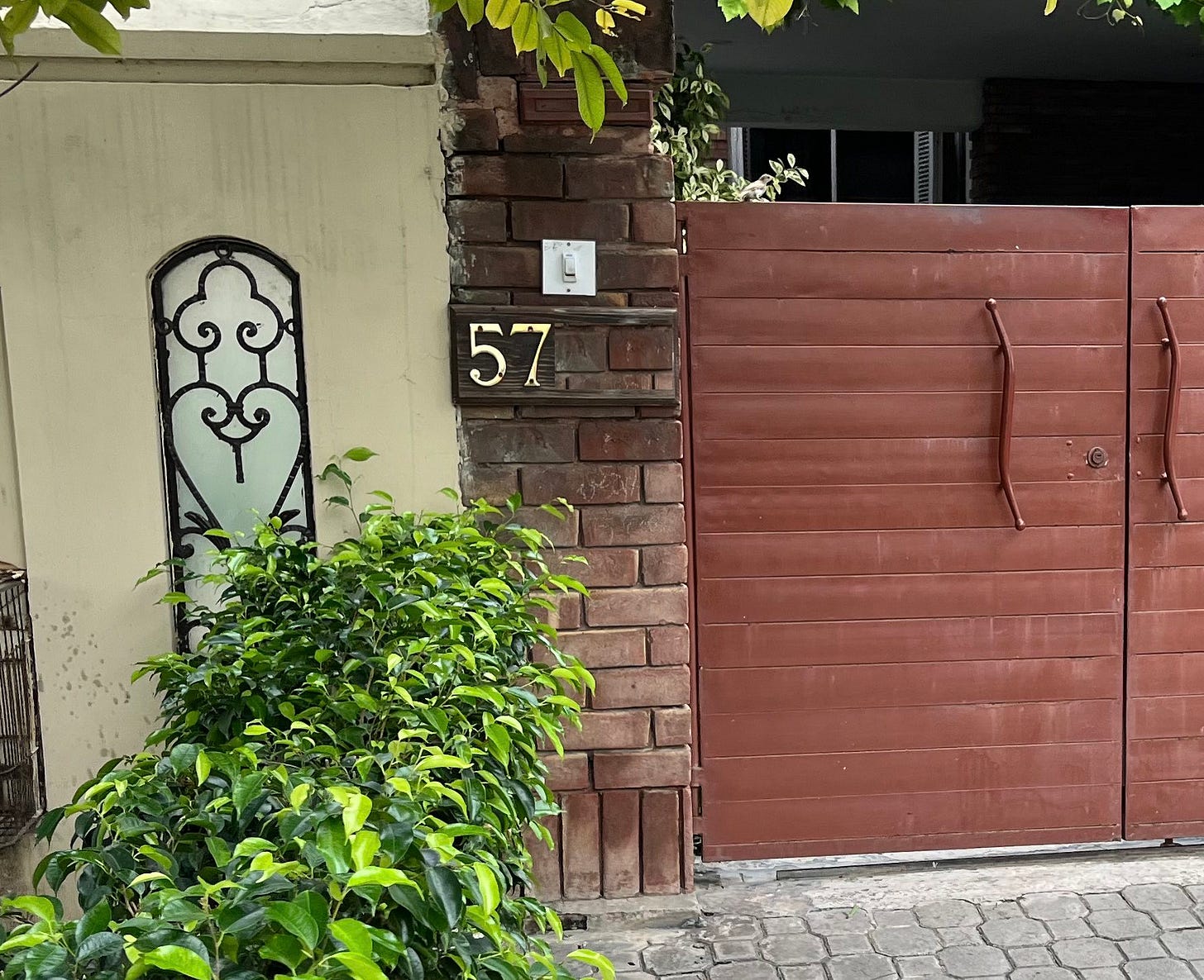
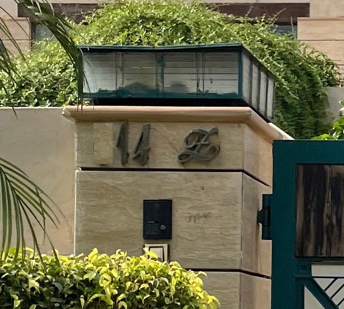
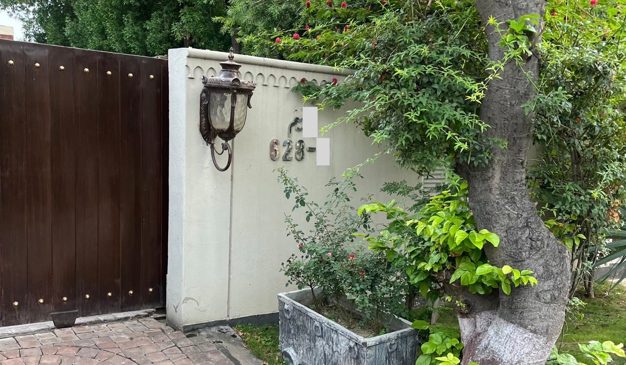
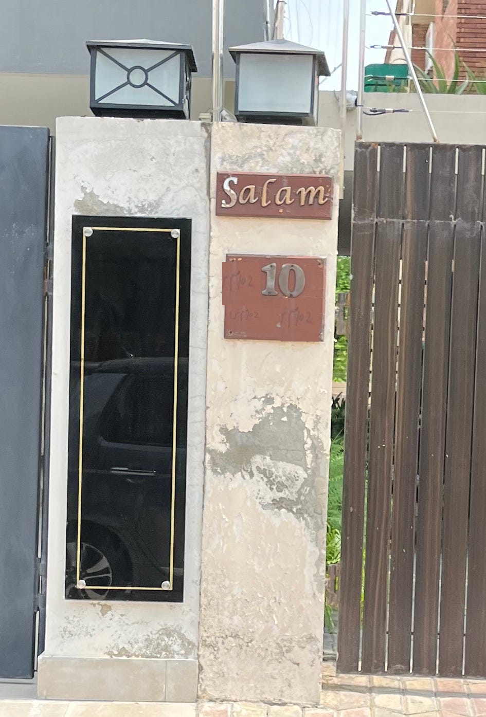
Chrome-plated lettering. Simple enough to execute, but with a variety of results.
Here it is being used to great effect:
But here the contrast is questionable:
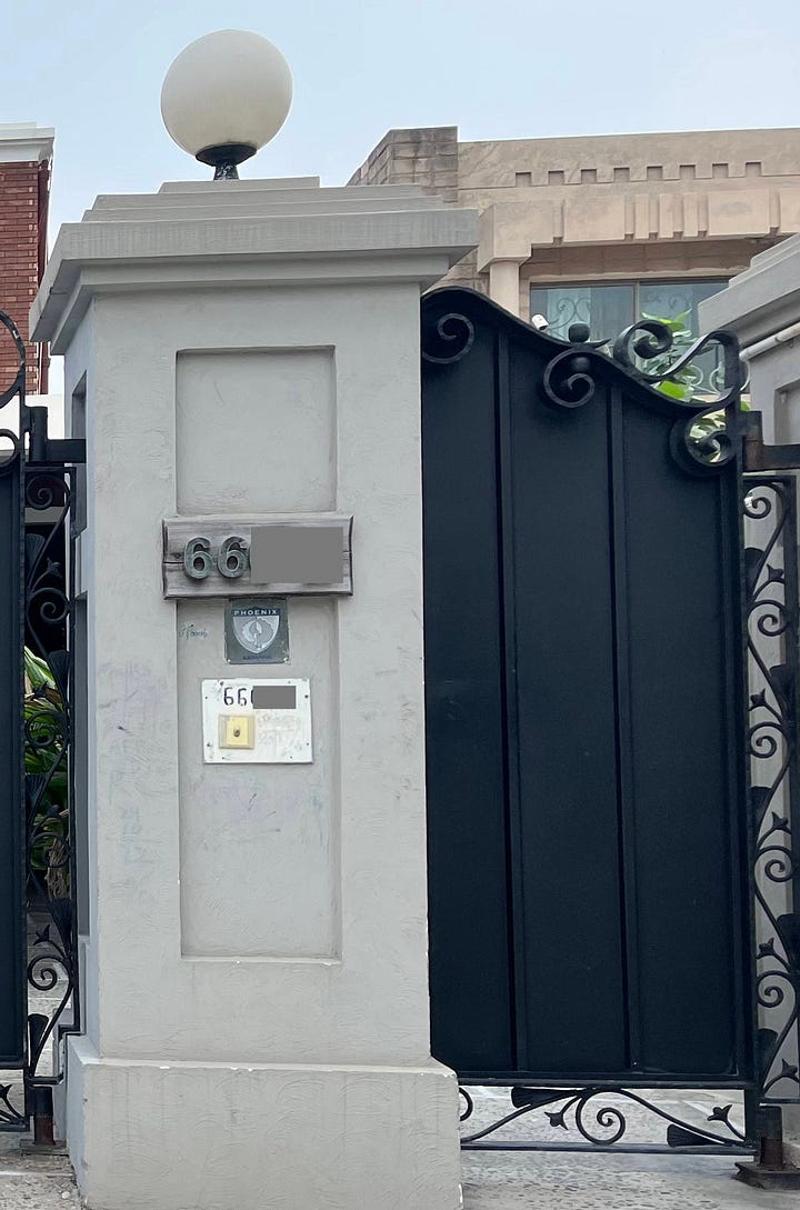
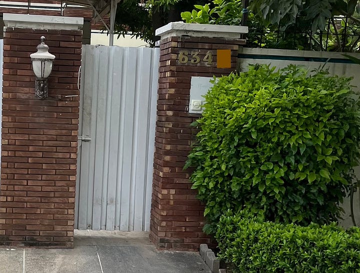
This one pushes the boundaries of readability by throwing in fancy lettering onto an already poor contrast ratio:
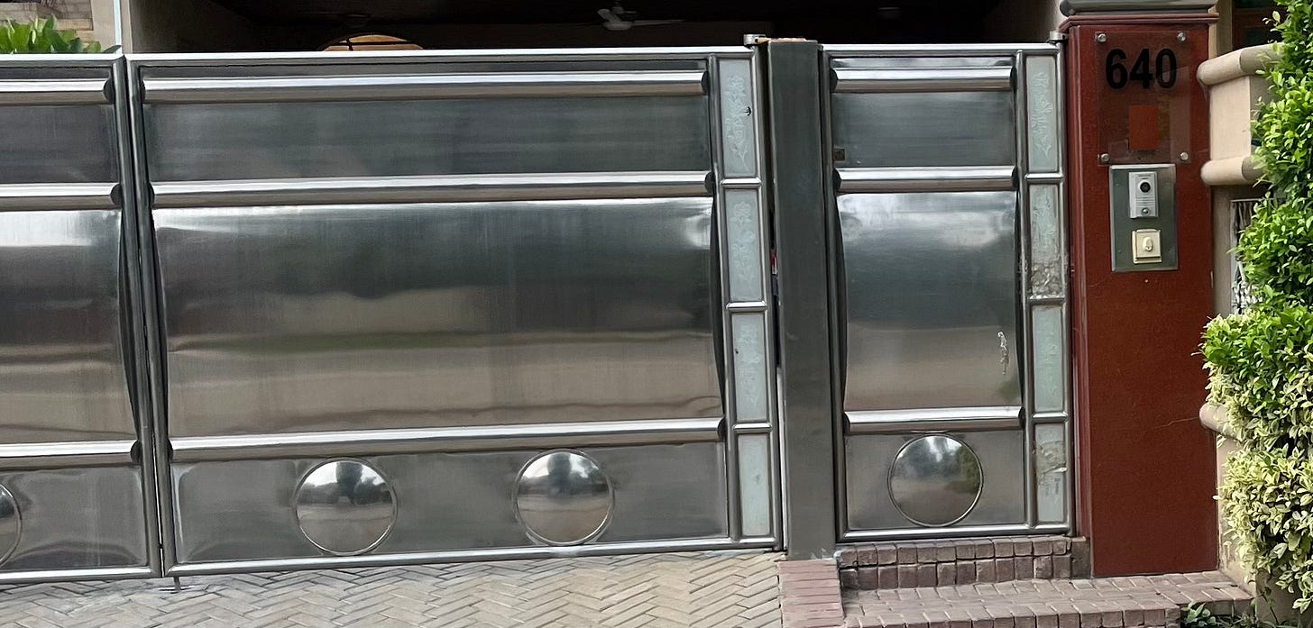
This one will vary according to lighting conditions and angles:
And this one has a cute ‘Salam’ to go with it, but the wear-and-tear of the numbering is making it hard to read the rest:
Score: 3/10 or 7/10 - depending on how it’s being used.
But mostly 3/10 because the reflections make it hard in The Foodpanda Test™, to read in most situations, and the chrome is also prone to fading over time.
The glass walay
Want to add a little bit of shashka to your address plate? Put it on glass.
Like the chrome plates, this has mixed results.
Black text against a white wall? Great contrast, 9/10, excellent readability:
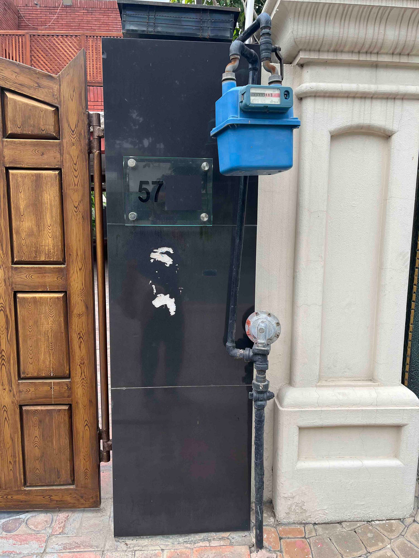
Black text against black wall? 1/10, bad idea:
And if you’re feeling extra adventurous, you could go with black over…red?
You could also go with white over red, but then make it really small for no reason:
Or you could make it really large, also for no reason:
Score: 5/10 - unless you know what you’re doing, don’t do it.
The address plates for ants
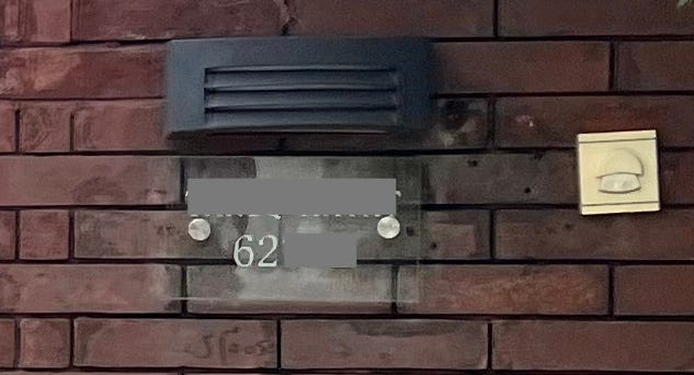
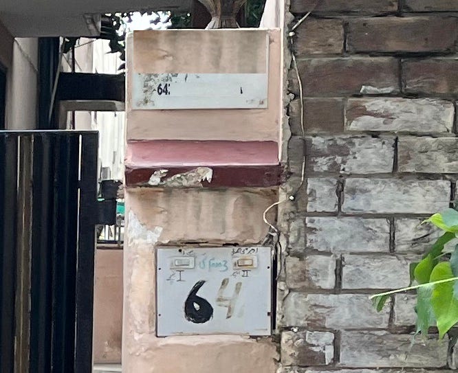
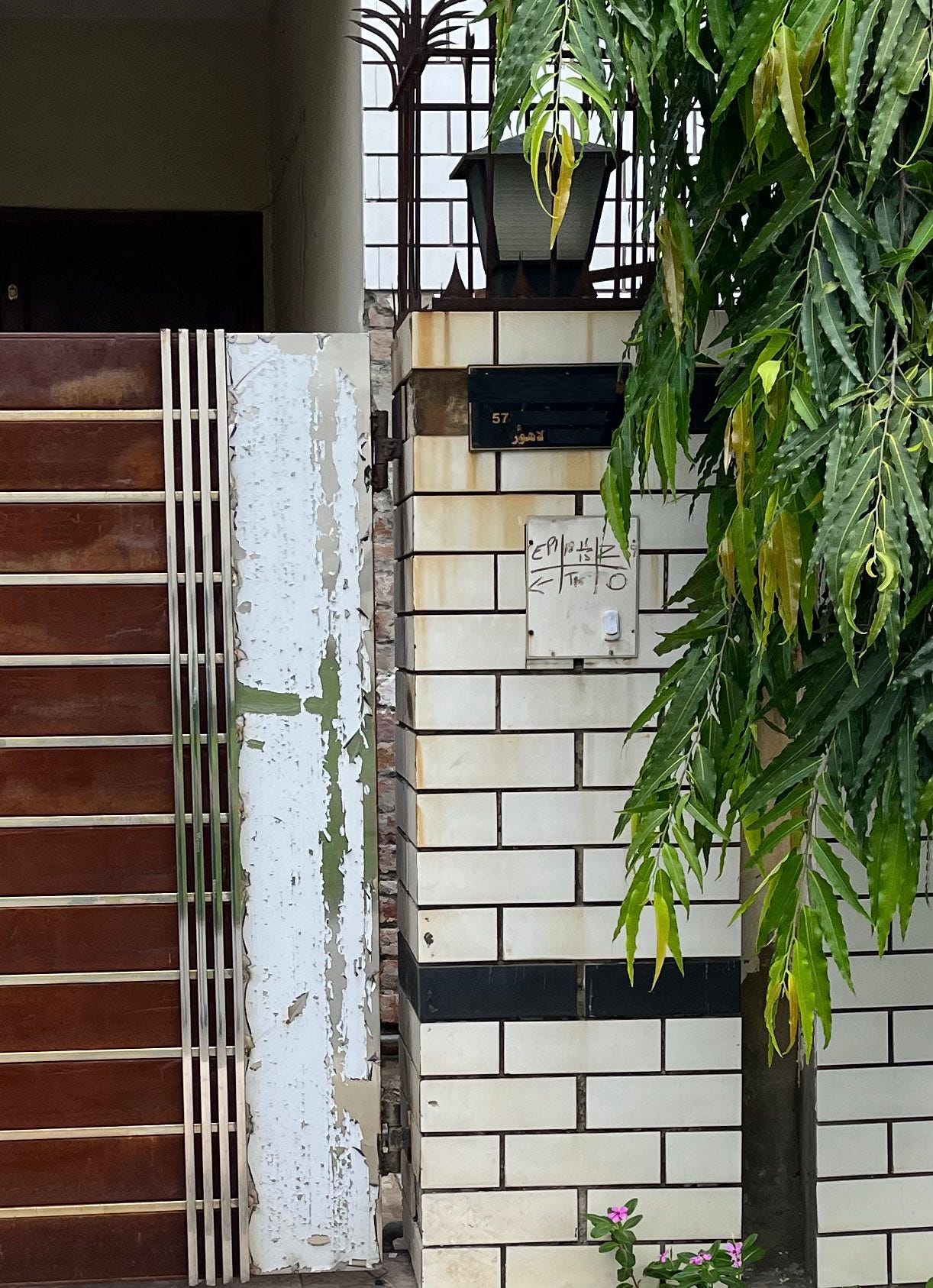
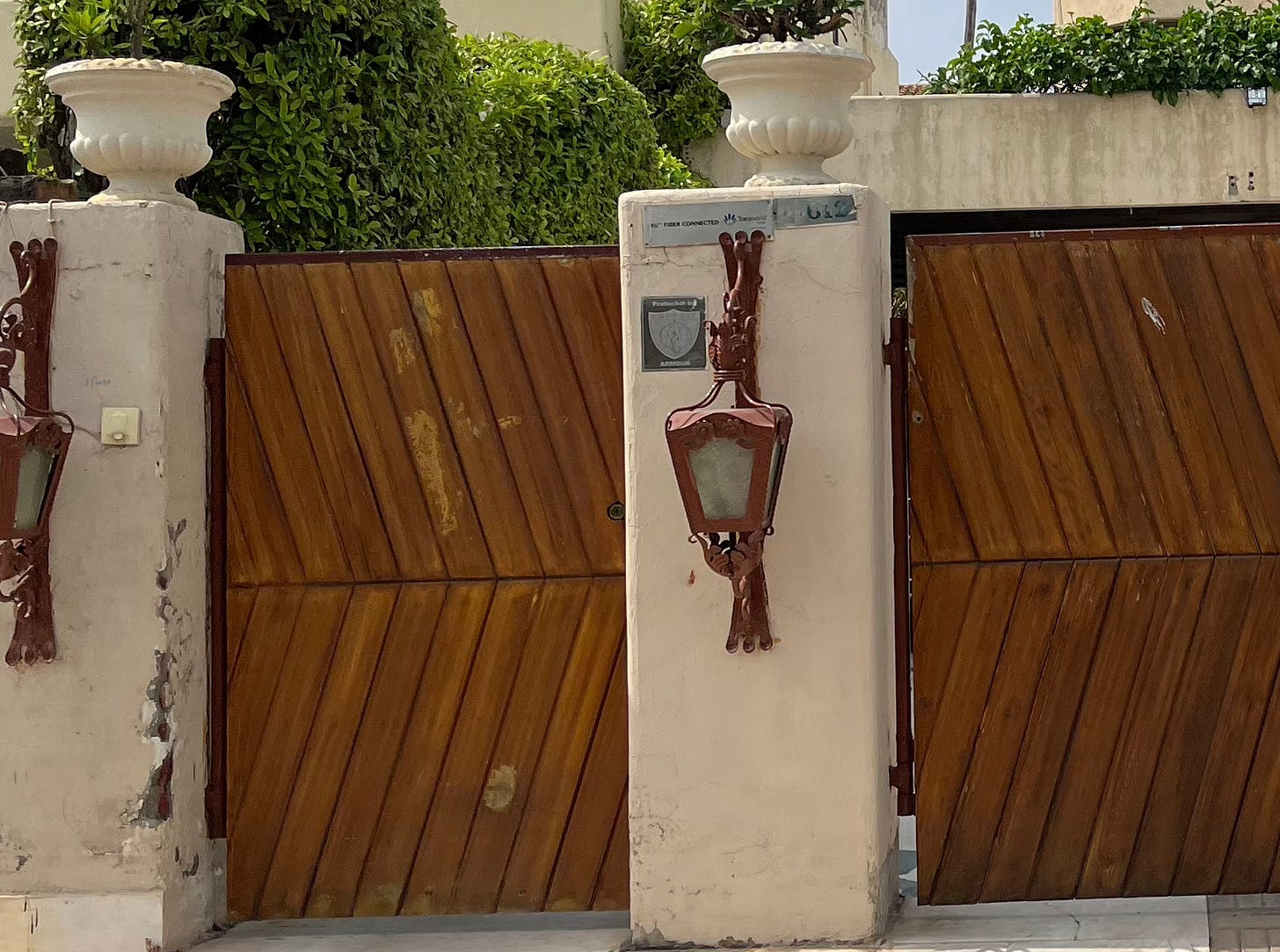
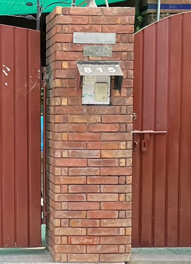
Why make your address plates legible? Just make the font size so tiny that it’s impossible to read from the street.
Get your pinch-to-zoom gesture ready, you’re going to need it.
Exhibit A:
Exhibit B:
And my favorite, which takes you a good few seconds to find even as a static image on your screen, let alone from a moving vehicle on the road:
Score: 0/10 - what’s the point?
The address plate for birds
Yup, it faces upwards for those birds-eye views of your address.
Score: 2/10
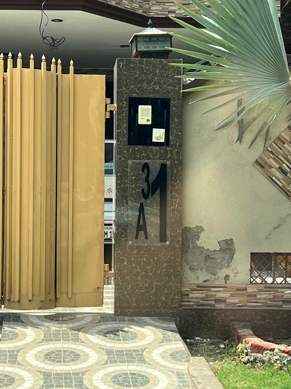
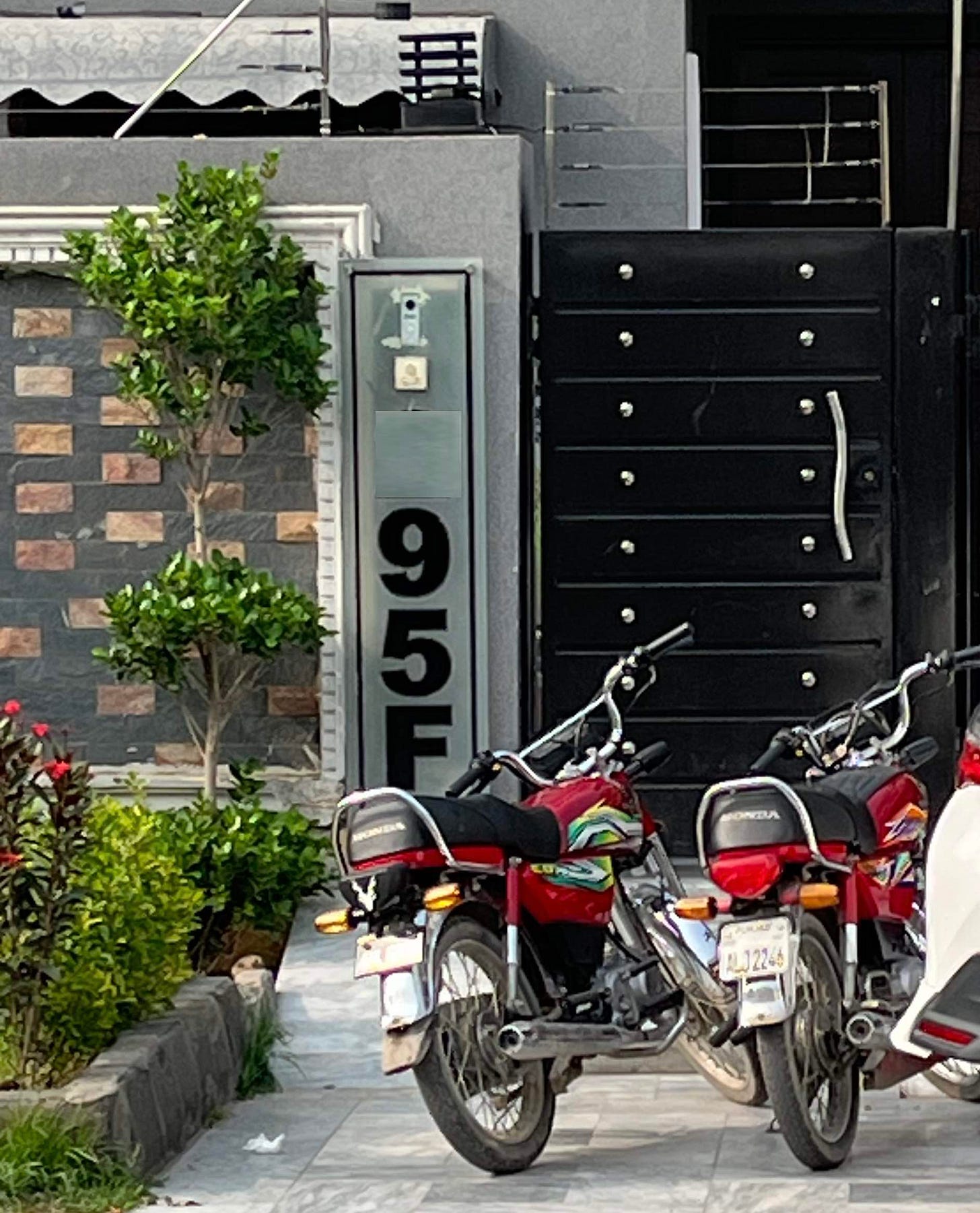
The vertical ones:
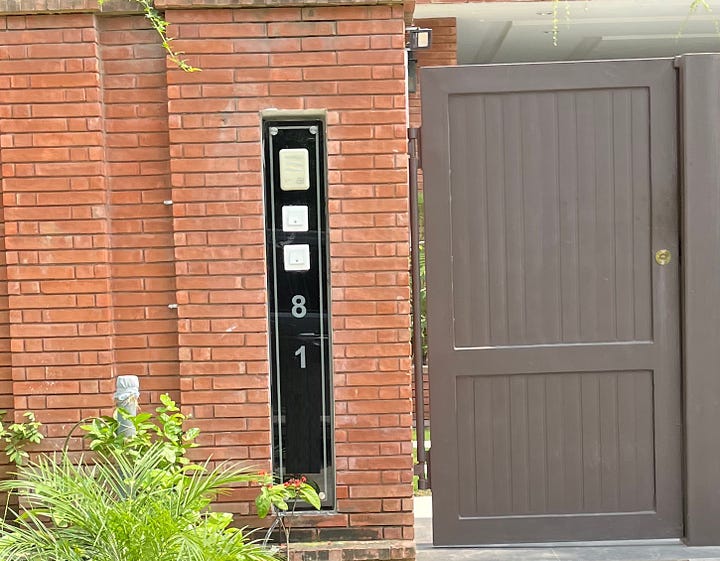
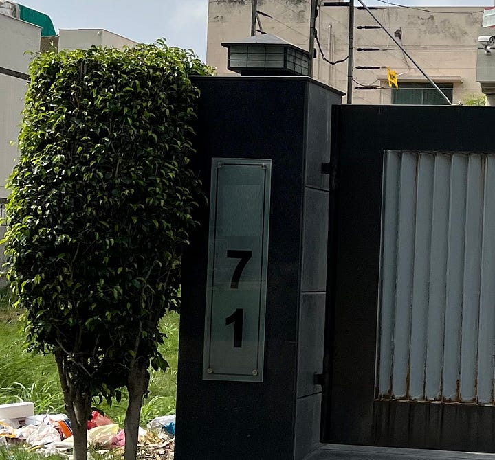
I’m not a huge fan of this style, even though it looks okay in some situations. Most people are accustomed to reading horizontally, not vertically. So it doesn’t pass The Foodpanda Test™.
Score: 5/10
The gold standard
So what makes a good address plate?
There’s no one-size-fits-all approach, but here’s a few things you could do.
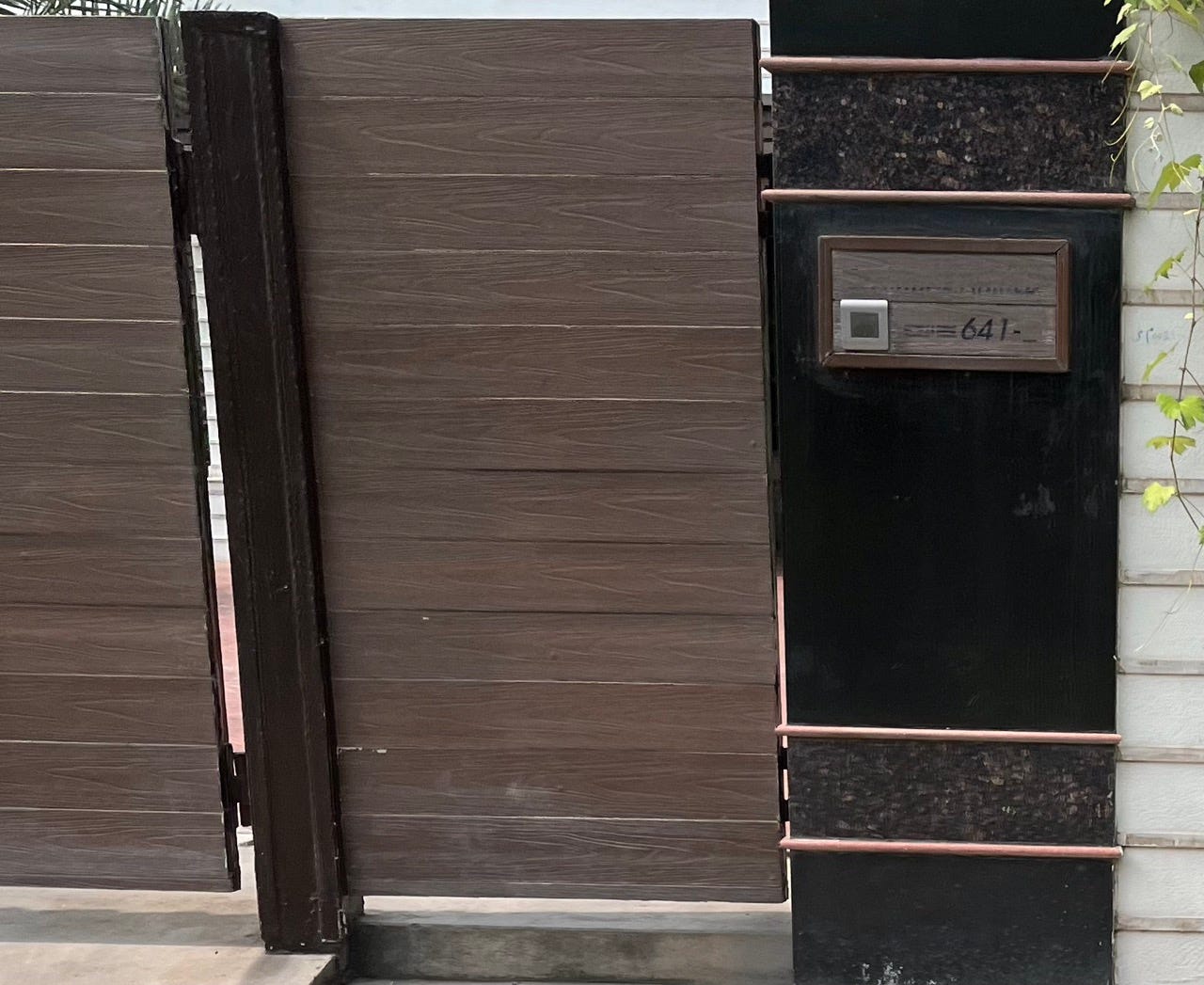
First you make sure it’s an appropriately-sized font:
Then maybe turn that vertical text into horizontal:
This gets the job done, though without much elegance.
So maybe you scale down the size, but retain the contrast:
Then you could choose a font that matches your architecture:
But don’t go overboard with matching your architecture/gate, because you might end up like this:
Maybe you could make it perpendicular to the street, rather than parallel, so it’s facing an oncoming vehicle:
Here’s a former hidden-behind-shrubbery plate that saw the light and joined the perpendicular-to-the-road gang:
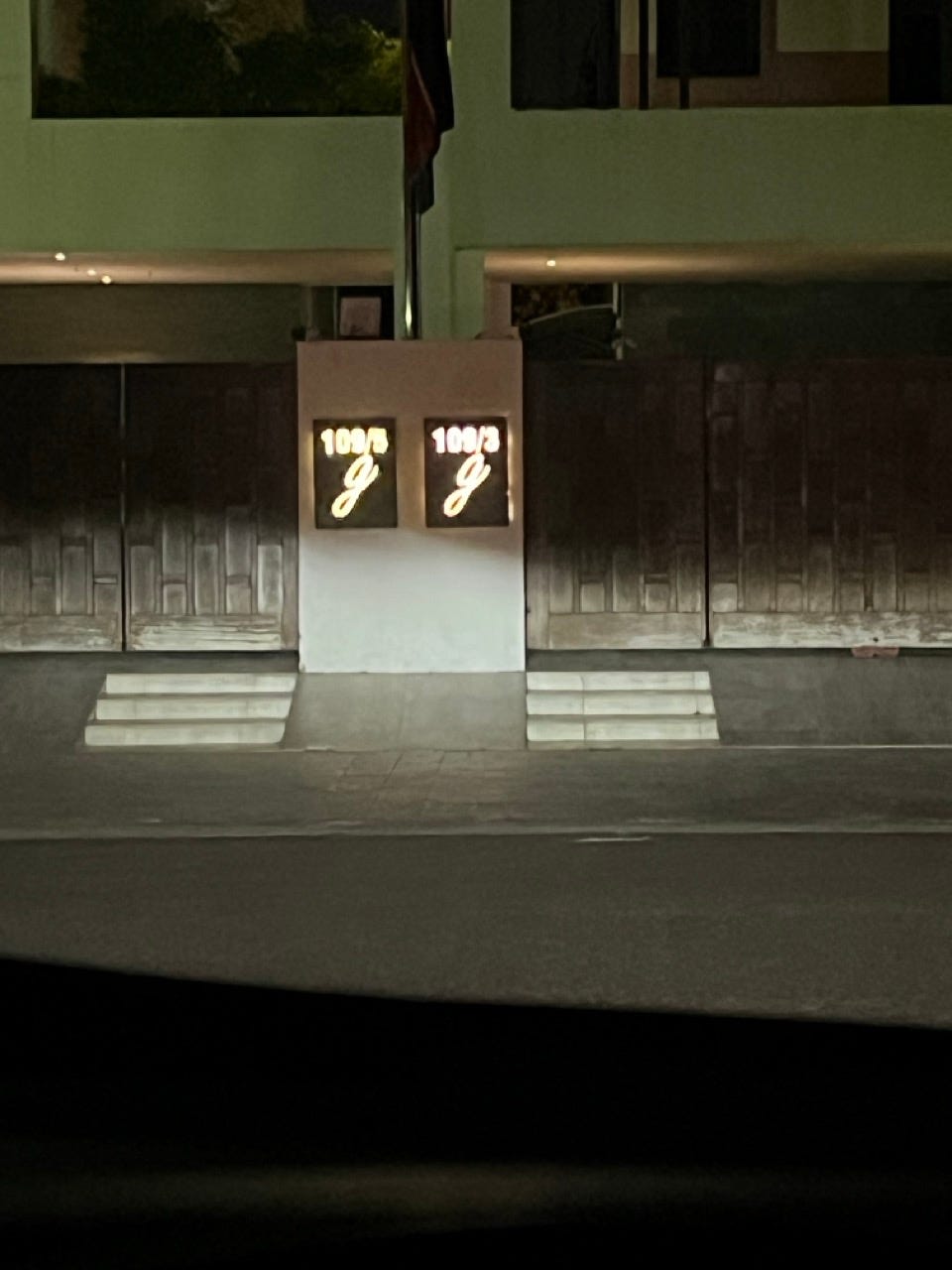
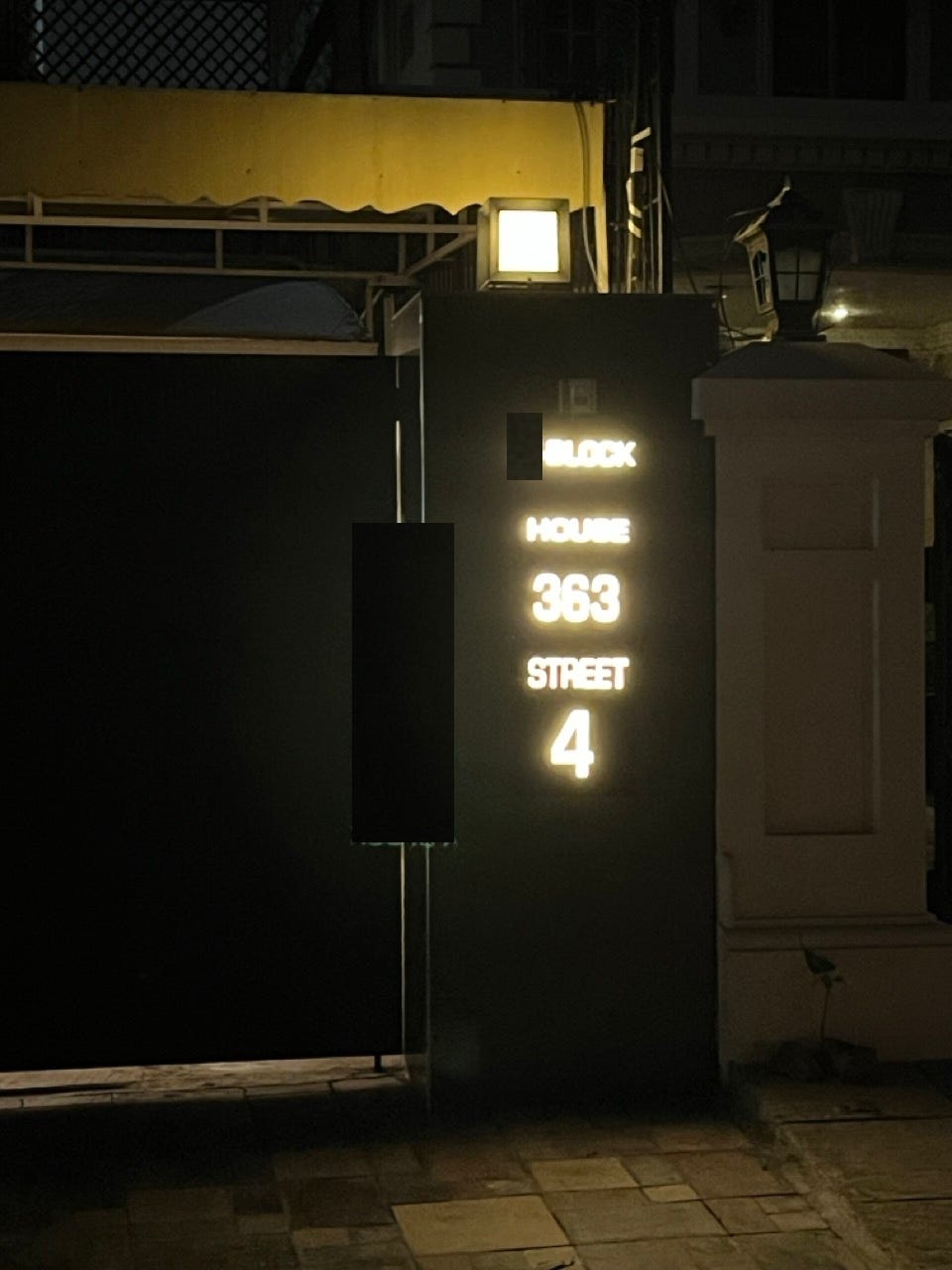
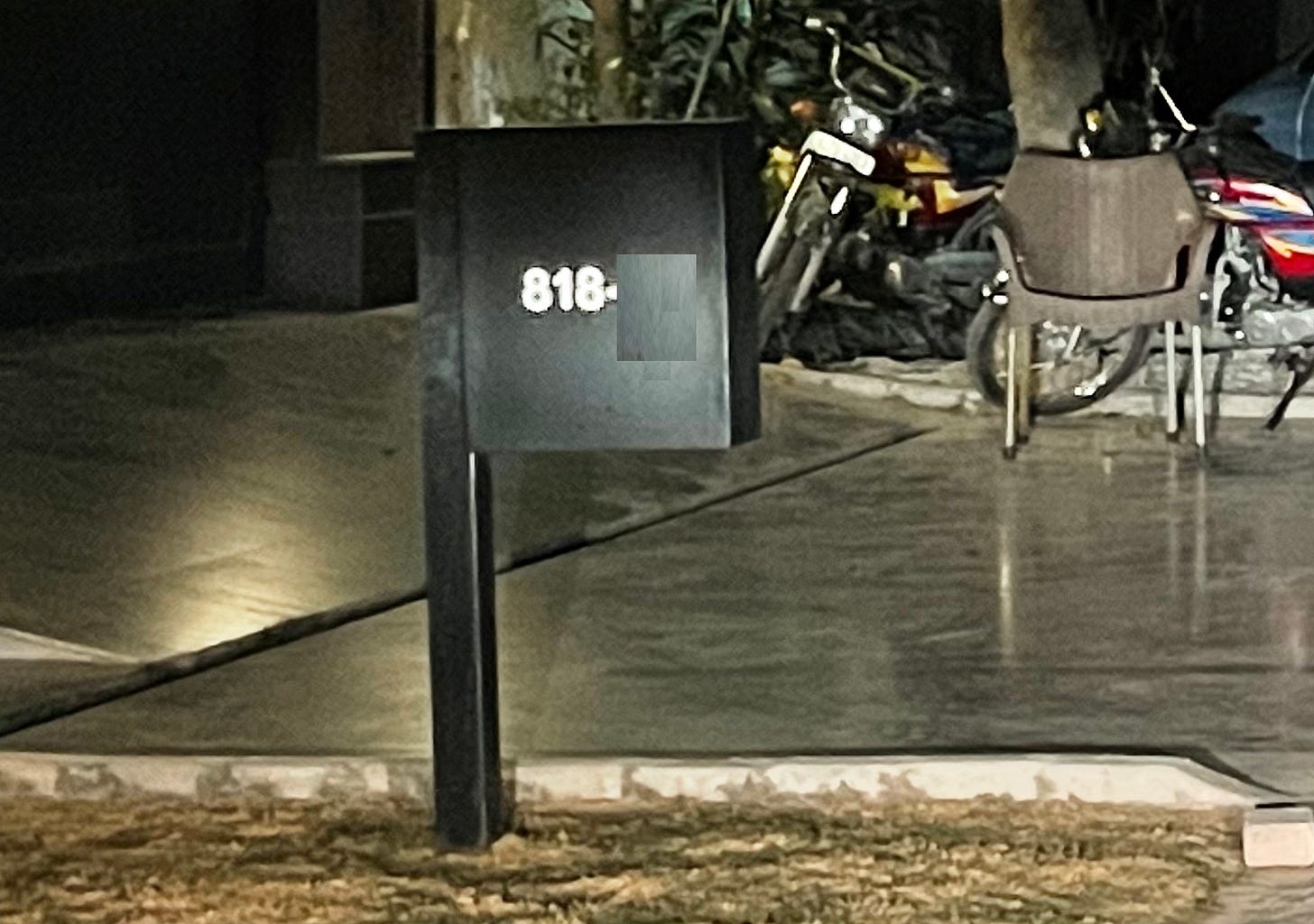
Speaking of light, you could add some night-time visibility, which I think is the single-biggest favor you could do for your Foodpanda rider:
Then you can really spell out your address, so there’s no doubts left:
This one is probably the best one I’ve seen so far. 11/10 execution for The Foodpanda Test™.
And if you want to conserve electricity, you could add reflective lettering to achieve the night-time visibility effect:
And make it multifunctional to boot:
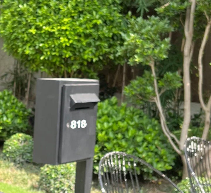
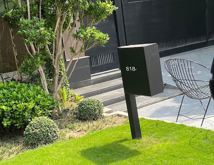
Great contrast, street-facing, night-time visibility, and it doubles as a postbox. Incredible.
It’s abundantly clear that many of these address plates were designed on a computer screen, where no doubt they looked fantastic.
But this review is a good lesson in how computer designs don’t always translate to real-world usefulness.
Have a 10/10 address plate for me to review? Send it my way.




Written with such creativity and a great balance of humour!
just lovely.